Ever wondered why some websites just feel better to use? It’s not just the content – it’s those tiny, delightful interactions that make you want to click everything. Today, we’re diving into one of those subtle yet powerful CSS tricks that can transform your basic buttons into engaging, interactive elements.
Let’s be honest – default buttons are boring. They sit there, lifeless, waiting for a click. But what if I told you that with just a few lines of CSS, you could breathe life into them? Make them beg to be clicked?
The Solution: Dynamic Arrow Animation
Here’s the CSS snippet that’ll change your button game.
First, set your button color, background and border properly:
.wp-element-button,
.wp-element-button:hover,
.wp-block-button__link,
.wp-block-button__link:hover {
    color: red; /* obviously, put YOUR color here */
    background: transparent;
    border: 0px;
}
You can do this in the theme.json file as well.
Then, set this CSS in the style.css file of your theme:
.wp-block-button__link {
    &::after {
        display: inline-block;
        padding-left: 0.3em;
        font-size: 1.5em;
        top: 0.12em;
        position: relative;
        content: "\0279E";
        transition: translate 0.1s ease-out;
    }

    &:hover {
        &::after {
            translate: 0.2em 0;
        }
    }
}
And voilà!
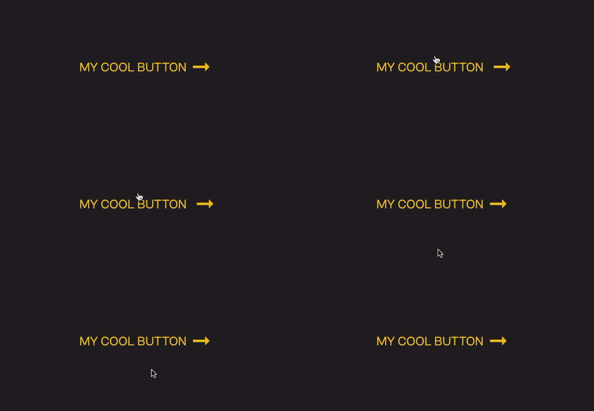
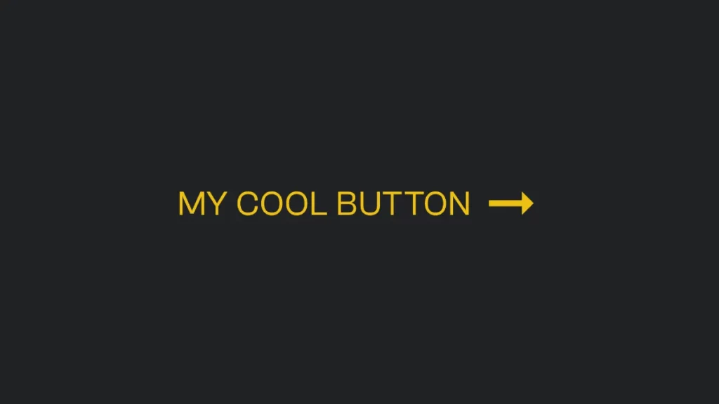
The result:

Breaking It Down
- The Arrow: We’re using the Unicode character
\0279Eto add a right arrow after your button text. - Positioning: The
padding-leftandtopproperties ensure perfect alignment with your text. - The Magic: On hover, the arrow slides right by 0.2em, creating a subtle but engaging animation.
Why This Works
The human brain is wired to notice movement. By adding this small, directional animation, you’re:
- Drawing attention to clickable elements
- Providing visual feedback
- Creating a more polished, professional feel
The Bottom Line
Great web design isn’t about flashy graphics or complex animations. It’s about thoughtful, intentional interactions that guide users naturally. This CSS snippet is more than just code – it’s a way to respect your users’ intelligence while gently nudging them towards action.
Remember: The best design elements are the ones your users don’t consciously notice, but subconsciously appreciate.
